Design
Create intuitive and beautiful products with Material Design.

Guidelines
Material Theming
Learn how to customize Material Design to change the look and feel of your UI, expressing brand and style through elements like color, shape, typography, and iconography.

Design Components
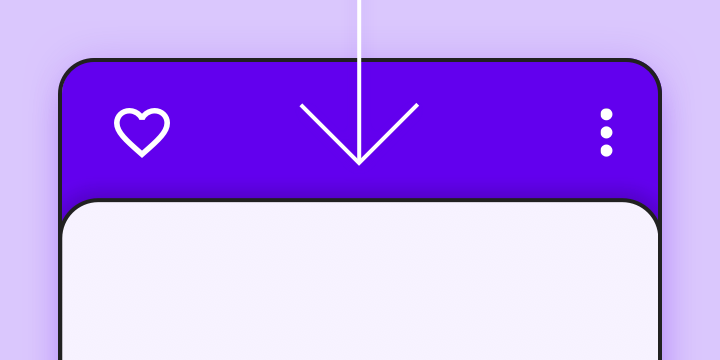
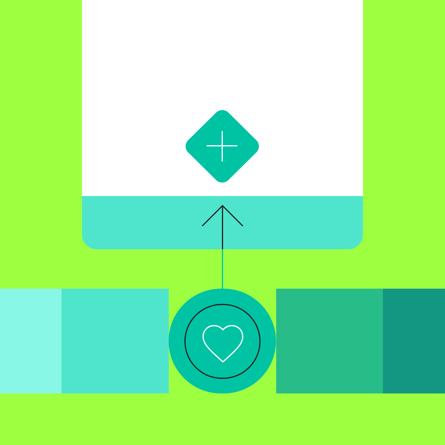
Bottom sheet
Use bottom sheets to display supplementary content on a surface anchored to the bottom of the screen.
What’s new
The latest Material Design updates and guidance
MAY 07, 2018
Text fieldsNew: Expanded guidance and high-emphasis text fields.
MAY 06, 2018
Extended FABNew: The extended FAB is a wider primary button (with a text label) for desktop and mobile.
MAY 04, 2018
Layout: densityLearn techniques for creating effective dense UIs.
Material articles
Make progress faster, with these helpful articles.
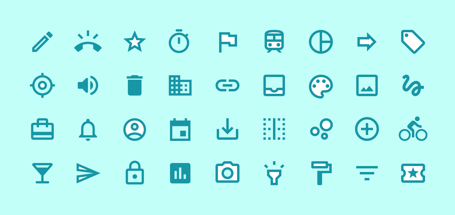
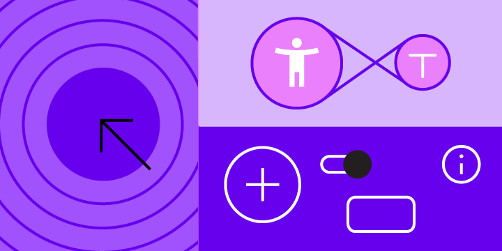
System icons
System icons symbolize common actions, files, devices, and directories. Each icon is reduced to its minimal form, expressing essential characteristics.
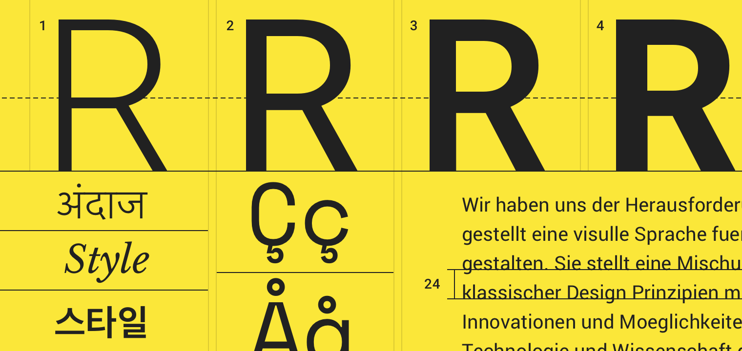

The type system
Use typography to present your design and content as clearly and efficiently as possible.
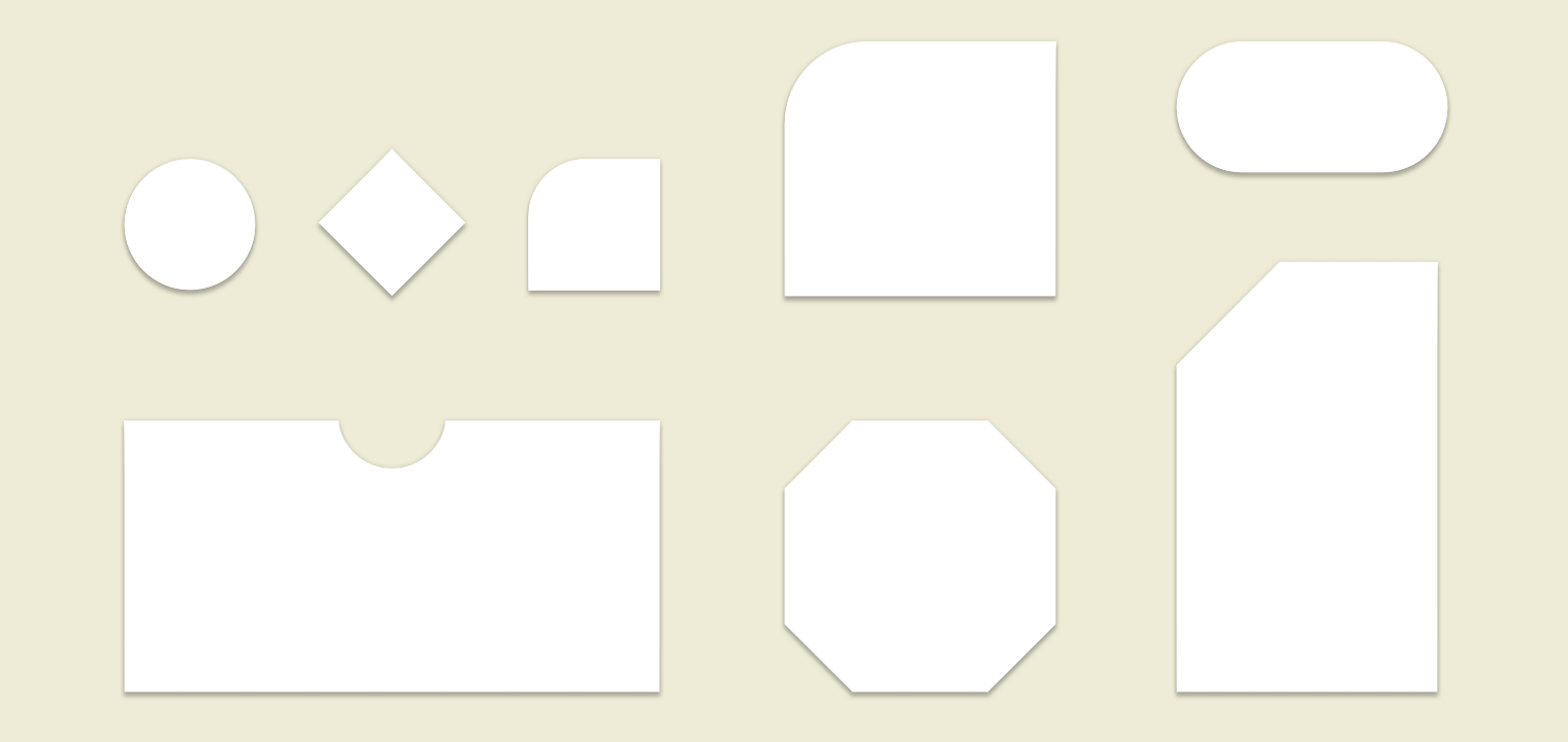

Harness the power of shape
Shapes can direct attention, identify components, communicate state, and express brand.
Material studies
Get inspired by the ways Material adapts to different kinds of brands and digital products – from travel apps to e-commerce and email.
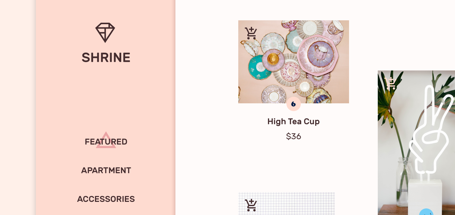
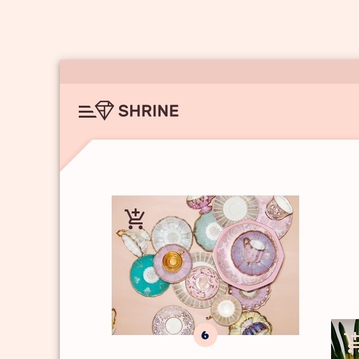
Design for retail
Learn how Material can be used in retail products by diving into the details of Shrine, a lifestyle and fashion app.
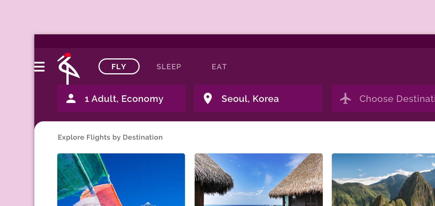

Travel treatment
Discover the ways Material was used to design and build Crane, a travel app for managing trips.
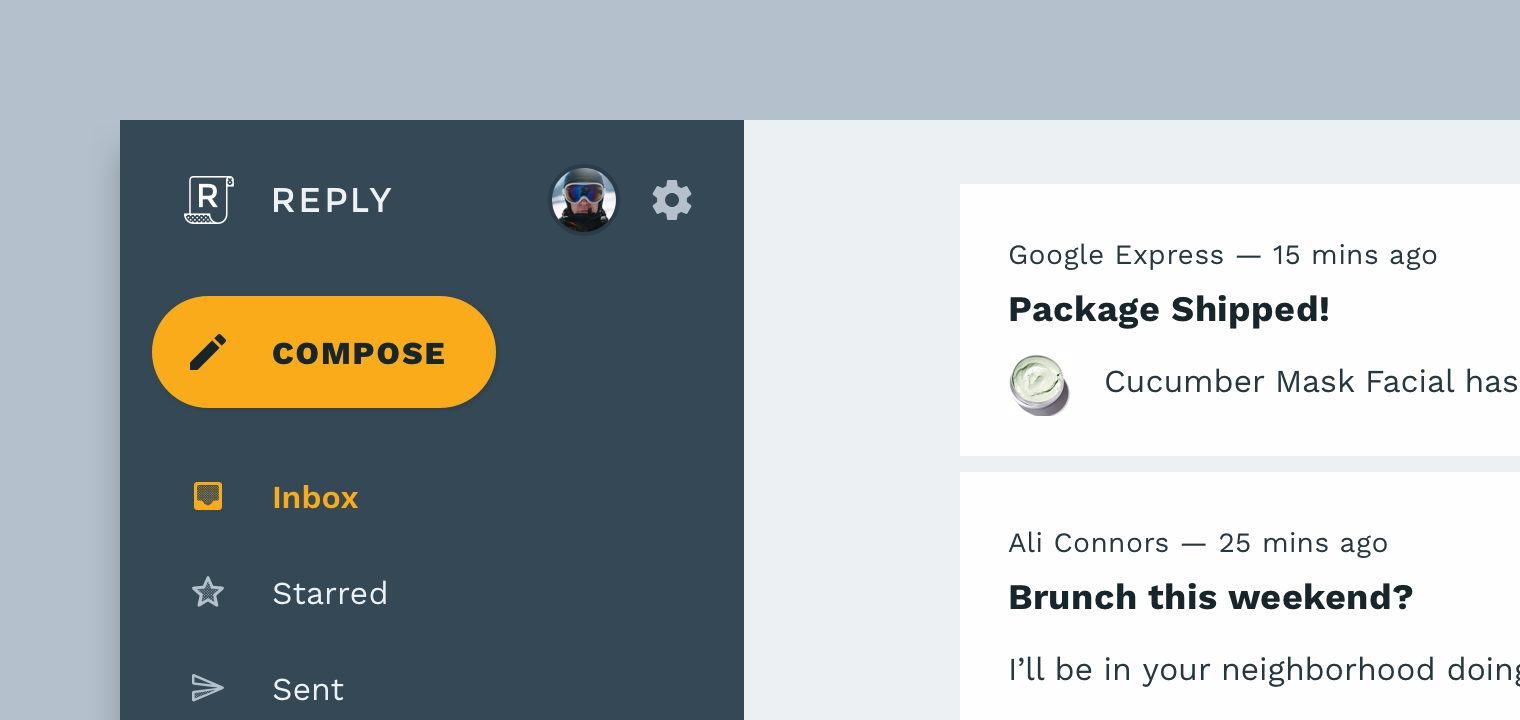

Crafting communication
Material can be used in communication and planning products. Learn how with Reply, an efficient email app.
YouTube
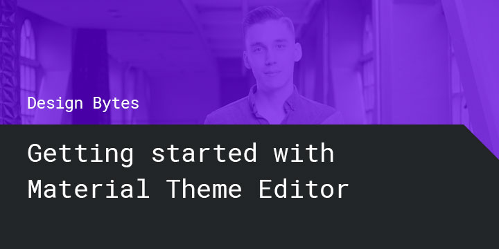
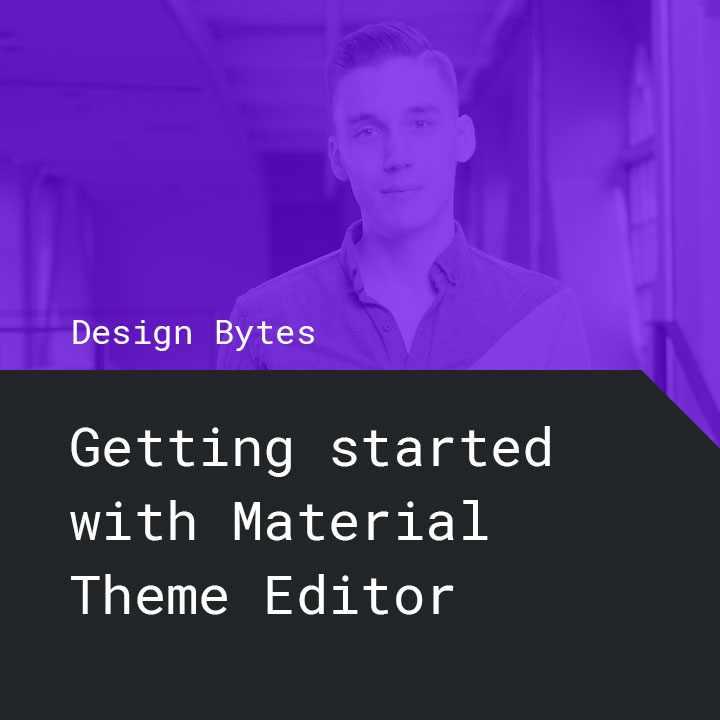
Create your own Material theme
Learn how to use the Material Theme Editor to customize components and create your own branded symbol library.

Google Design
Making more with Material
Get to know Material Design’s new end-to-end features so you can design flexibly, develop across platforms, and customize more easily.


Developer Tutorials
Build with Material Components
Start implementing Material Components with hands-on lessons for Android, iOS, web, and Flutter.
