Great design is a reflection of the inspirations and aesthetics found in the real world. It is especially critical for a UX design company to create digital designs using natural and man-made design references. Mood boarding is one such UX research technique to shape digital landscapes by gathering various closely-related design ideas and concepts. The practice enables UX designers to pin down their thoughts and design motivations to creatively build intuitive digital products.
This blog post explores the significance and use-cases of mood boards in the UX design process.
Mood Boards and their Significance in the Design World
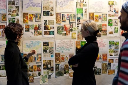
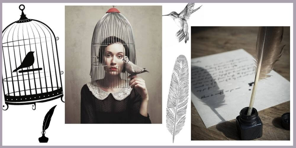
Designers use mood boards as a canvas to express a certain design idea in the form of images, fonts, types, etc. The idea is to visualize the final design by capturing inspirations and elements that resonate with a brand’s identity. An ideal mood board includes a collage of graphics, UI features, icons and other items that describe a brand beyond words.
Paul Rand, the logo designer of IBM, UPS, and other global corporates, explains the art of curating designs in the following quote-
“The artist is a collector of things imaginary or real. He accumulates things with the same enthusiasm that a little boy stuffs his pockets. The scrap heap and the museum are embraced with equal curiosity. He takes snapshots, makes notes and records impressions on tablecloths or newspapers, on backs of envelopes or matchbooks. Why one thing and not another is part of the mystery, but he is omnivorous.”
― Paul Rand: A Designer’s Art
Mood boards can be represented in physical as well as digital forms. The display items over a mood board may include sketches, fabrics, color palettes, textures, shapes, typography, and several other design elements.

The primary objective of curating a mood board is to share a common vision of the web interface, product design or a brand’s personality. It streamlines the UX design process by representing a broad outline of the final design.
Here’s how mood boards set the stage for effective digital designs-
1) Establish the Vision
Mood boards serve as tangible catalysts to showcase the research material assimilated by providers of UX research services. It enables the entire design team to establish and share a common vision and goal of the final design. Although mood boards are not as accurate as wireframes or prototypes, they establish the emotional and sensory image of the brand design.
2) Collaborate with Stakeholders
Getting stakeholder buy-in for UX research can be a strenuous task. However, the time and cost-effective attributes of mood boards make them a readily acceptable UX research technique among stakeholders. Moreover, providers of UI UX design services may collaborate with decision-makers to bookmark their requirements before investing in the final design.
Today, various online platforms such as Pinterest and Tumblr serve as dynamic mood boards to curate and share design inspirations. However, professional web design services strongly recommend physical mood boards to create firm impressions of the product’s design.
Different Ways of Mood Boarding
1) Using Photographs and Visuals
While there’s no dearth to the number of pictures that can be used for a mood board, a consistent brand tonality is important. UX designers must curate high-resolution graphics, visual elements, real or vector images, and snapshots that closely represent a product’s designs. Digital mood boards can also hold short videos or gifs to explicitly talk about the idea.

2) Scribbling Phrases and Quotations
Words underpin a certain meaning to the images. User research consultants can use contextual phrases or slangs commonly used by the target audience of the product in hand. Write-ups for mood boards can also include taglines, brand values, positioning statements, marketing slogans, and other significant brand quotations.

3) Including Colors, Shades, and Fonts
A definite color palette and typography are the most effective design elements to reflect a brand’s identity. Providers of user experience design services should carefully study a product’s usability and impact to collect similar shades and fonts. Mood boards prove to be an easy tester for scores of shades and fonts. It enables designers, developers, and stakeholders to visualize the final design with a chain of tones and voices.

Building Impactful Global Designs | UX Design Company
We, at Oodles, are a creative UI UX Design Studio that provides industry-appropriate design solutions for websites, mobile sites, and mobile applications. Our UX design team uses the latest tools and technologies to build user-centric and result-oriented digital products. User personas, empathy maps, competitive reports, mood boards, responsive wireframes, and prototypes are some of our various UX deliverables. Talk to our design team to know more about work.


