UX designing involves collaborative research to organize UX features, identify user needs, and achieve business goals. Dot voting is one such UX research methodology that channelizes diverse UX elements to ease the designing process. Its rapid filtering ability enables businesses to reach a design consensus well before investing time and resources in the final design. However, the success of the dot voting technique depends on accurate UX essentials mapped by the providers of UX research services.
This blog post explains dot-voting in a simple 4-step process to streamline UI UX design efforts.
Understanding Dot Voting and its Significance
Dot voting is a business tool used to collaboratively prioritize and align design alternatives for a certain product or service. Among UX designers, it is commonly known as “dotmocracy” as it follows a democratic process to decide a product’s key features and elements.
In dot voting, each participant is given a certain number of votes (or dots) to indicate their choice among different alternatives. These alternatives can be displayed in the form of a distinct or combined bunch of items depending on their contextual use cases.
The key features represented in this technique include diverse design ideas, usability variations, UI flow, and other crucial design touchpoints.
In 2005, Google created a Design Sprint framework that addresses critical business challenges through a five-day designing, prototyping, and testing process.

Within the sprint, dot voting is one of the major gateways to decide the final design specifications by welcoming disparate perspectives. Today, a variety of businesses and providers of UX UI Consulting Services use design sprints to analyze and conclude design blueprints.
Steps involved in Dot Voting
1) Pen down Ideas and Motives
The foremost step is to brainstorm and populate all thoughts, opinions, design essentials, users’ needs, and other important design aspects. The activity is conducted by distinguishing the set of items with similar color sticky notes splayed across a whiteboard.
UX research consultants can also display unique user personas to reflect key user experiences and pain-points. Also, it is advisable to rope in as many members as possible preferably from varied backgrounds to share real-life design experiences.
For instance, below is a quick version of a dot-voting exercise conducted to outline the workflow of an eCommerce website. As demonstrated, UX researchers must define precise and starkly distinguishable alternatives that prevent overlap and confusion among voters.

2) Convey the Voting Rights
Before commencing the voting exercise, convey clear instructions regarding the use of dot stickers and votes. Each individual should be given votes that are approximately equal to a quarter of the total number of options available.
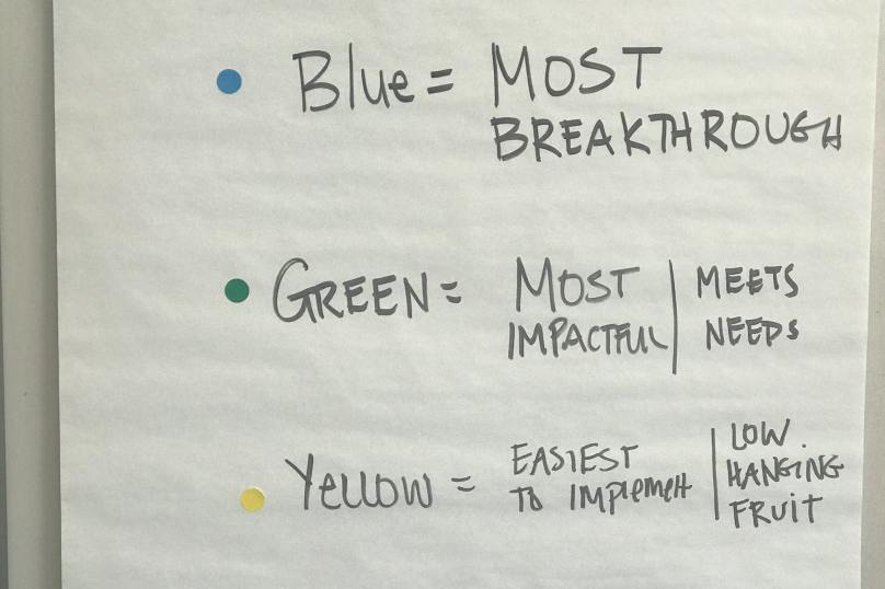
Although traditional organizers use single-color dots, UX teams can also use color variations to indicate the purpose and impact of dots.
Also, participants should cast their votes within the boundaries of their expertise. Suggesting that, developers should use their votes based on technical feasibility whereas designers should back their votes with the usability criteria.
3) Evaluate the Result
At the end of the voting exercise, evaluate the option with the highest density of dots. Before jumping straight to the conclusion, initiate a collaborative session to discuss-
a) Why the participants have voted for a particular item?
b) What problems does the product solve by adding the most voted items?
c) Does the outcome justify the shared vision of the product?
d) Does the prioritized feature list reflect on the market trends, competitive landscape, and future industrial practices?
The above-mentioned questions enable the UX team to dynamically approach the phase of prototyping that thoroughly tests the design’s usability.
4) Iterate and Revote
The challenge with dot-voting is that it may lead to muddled results. The uneven distribution of votes and tie-up between top priorities can halt the progress indefinitely.
The solution is to draw a clear plan of votes and choices. Further, iterate your design elements in adherence to the responses of participants. To break a strong tie between top alternatives, ask the participants to revote for the set of items in question.
You may also like to read- Designing an Engaging WordPress Website | 5 Quick Tips and Tricks
Dot-Voting | An Effective Methodology for UX Research Services
Instrumental solutions are always an outcome of combined team efforts.
Dot voting is a reliable UX research methodology that prevents power dominated results and ensures an equal contribution by everyone. It is a time and cost-effective technique used by leading providers of UI UX Design Services to build seamless digital designs.
Our UX research consultants at Oodles Studio conduct in-depth research about the digital requirements of your business. Our UX research services include User Persona Development, Competitive Analysis Reports, Information Architecture Diagrams, and other UX reports. Talk to our UX/UI design team to build intuitive and effective digital interfaces for your business.
Image Source- Google


