
Industry- appropriate Mobile Navigations in Mobile App Design Services
Hick's law says that the more choices we present to users, the longer it takes them to make a decision. Compressed menu designs or minimalist menu options suit businesses with a limited range of offerings. However, UX design services for a large entity such as Amazon cannot include minimalist menu designs.
So, what is the best solution to display menu items according to your business size?
1) Mega-menus for Industry Giants
Mega-menus are large drop-down lists that display all the major category links of the business services. The items in the list are clickable and take users to the landing page of that category label. Mega-menus are displayed within the ‘Services/Shop/Specialities' tab within the top navigation bar. The list items can be further segregated into sub-categories, to enable users to narrow down their search.

Although web design services have enough room for mega-menus, they hinder user experience on mobile screens. Now UX designers have devised effective means way to compress mega-menus for mobile screens.
For instance, Amazon has minimized its global navigation inside the ‘Shop by Category' tab. The design technique includes all categories in a vertical list with split buttons to show further divisions.
UX designers must avoid displaying items in alphabetical order. They should instead portray the list of items into similar categories.

However, the same design technique may not work for organizations whose users are unfamiliar with all of its services.
For instance, medical institutes such as BLK hospital cannot compress their services within a ‘Facilites' tab. In such cases, it is critical for the organization to clearly inform users about their specific services. It not only enables users to make a quick decision but also leads to better navigation.

2) Hamburger Vs Kebab Menus for subject-specific organizations
Have you ever noticed the menu navigation icon while scrolling through your G-mail or WhatsApp account?
Google has smartly minimized the menu choices for its separate business lines within the left-aligned hamburger navigation. The design practice involves an icon with three vertically aligned lines.

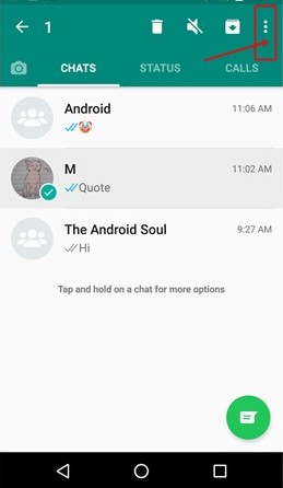
On the other hand, WhatsApp places the menu on the top-right corner of the screen inside three vertically aligned dots.
Both the Hamburger and Kebab navigation are by far the safest and most effective navigation designs for mobile screens. However, it is important to take note of the following tips before finalizing any one of the two menu navigation-
- Users are better able to skim through the choices if they are displayed in a left-to-right alignment. It is therefore advisable to present menu items in a left-aligned pattern.
- Experts suggest that displaying the menu categories in an all-caps fashion reduces the legibility by almost 10%. Thus, the category names must be displayed with only capitalized initials. It improves readability and eventually the user experience.
- Further, the color contrast between the category name and the background of the page must be balanced correctly. It enables users to clearly interpret the text and choose effortlessly.
You may also like to read- Best Practices in Typography for Enhancing Brand's Digital Identity
Conclusion
The menu navigation designs for mobile screens are still in their embryonic age. Mobile app design services are constantly experimenting with a variety of distinct menu icons and displays. However, the above-mentioned tips are evidence-based techniques to significantly optimize the user experience and drive maximum user engagement.
Oodles Studio provides Mobile App Design Services for iOS and Android mobiles, smartwatches, wearable gadgets, and other smart devices. Talk to our UX design team for building dedicated mobile applications from scratch and refining existing mobile interfaces.
*Study Source- https://www.statista.com/statistics/284202/mobile-phone-internet-user-penetration-worldwide/
Image Sources- Google


