The venture capitalist Marc Andreessen of Andreessen Horowitz, a venture capital firm behind Box and Foursquare argues in his Pmarca Blog Archives ebook that due to poor pitch quality, investors have to use referrals to source startups.
VCs only meet startups through their networks. The reason behind this is, too many startups that they could meet are non-professional and uninformed. That's why those other startups are not fundable. The entrepreneurs who go into the VCs meetings prepared, have an advantage. The most important question founders ask a mobile app design company is what they must bring to the pitch. A deck may look great, but it's better to have an actual working prototype. Andreessen agrees by saying that the best thing to walk in with is a working product. Otherwise, a beta or prototype would be better if we can't get to a working product without raising venture funding. It might be a website that works but hasn't launched already, or a software mockup with partial functionality. Now, the question remains: how to leave a lasting impression with a prototype?
In this blog post, we will understand the 6 steps we can take to create a mobile app prototype and leave a lasting impression on Investors. So, let's begin.
6 Steps to Creating a Mobile App Prototype:
1. Research On The Problem

The first step to creating a quality app prototype is to ensure that we have a problem worth solving. The problem can extend from simple boredom issues from the app (such as games) to a corporate requirement (for the B2B market).
This first step may sound straightforward, and indeed it is. But it's a surprising fact that most people come up to mobile app design services just because their ideas seemed “cool”. Just because an idea seems “cool” is not a good reason for building an app. The reasons to build an app can be to make the communication easier, or to solve an existing problem.
While working with the clients, take them through a process that enables uncovering the purpose of the app. If possible, work on understanding the industry as a whole. Then understand the competitors, business goals, audience goals. Dig dip into understanding the features of the app that truly matters to their audience. After having a clear idea of their audience and the pain points the app solves, begin to design the user's journey.
All of the above steps may take considerable time. They are the most overlooked steps in the process. That's why many of the apps in the app store are in the bin.
Also, Read | Choosing A Suitable Mobile App Design For Your Business
2. Identify Key Functionality Requirements

After identifying the problem, begin to brainstorm the product requirements. It's a simple and fun exercise to list down the hundreds of different features your app should have. And that's exactly what we have to do!
Before building your iOS app or Android app, create a list of the features that make up your ideal app. Then begin to prioritize those items. Prioritize them by analyzing which features are the most important to your target audience versus what would be nice to have.
Take the top three to four features on your priority list and design your app with that in mind. Add other features after getting an idea that it resonates with your plan, and your app is something people actually want.
3. Create Sketches Of The Primary Screens

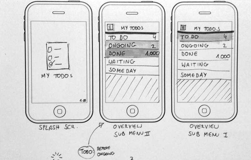
After figuring out the highest priority features, begin thinking through the user experience. One of the best ways of crafting the user experience is to draw a few rough sketches. Sketches of how the primary screens should look and feel. After we have the sketches, we are able to build out the screens we envisioned in more detail.
4. Turn Your Sketches Into Wireframes

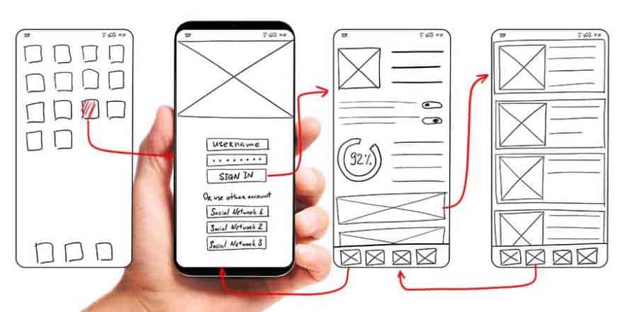
After having sketched your primary screens, begin to wireframe your sketches. A wireframe is a low-fidelity, simplified outline of your product that consists of lines, boxes, words, and sometimes descriptions. It serves as a framework of where your app will go rather than the final look and feel of the app.
5. Turn Wireframes Into A Prototype

Share your wireframes with a handful of people to test your product and gather feedback. We can turn low-fidelity wireframes to a basic prototype. Then we can share it with the target audience, friends, peers, manager, and boss for feedback on the app.
Prototyping makes the product more real for investors. It also gives your testers the ability to get a real feel for what it would be like to use the app. It also prepares your developers with a better sense of the intended UX before finalizing the design.
6. Translate Wireframes Into Final Designs

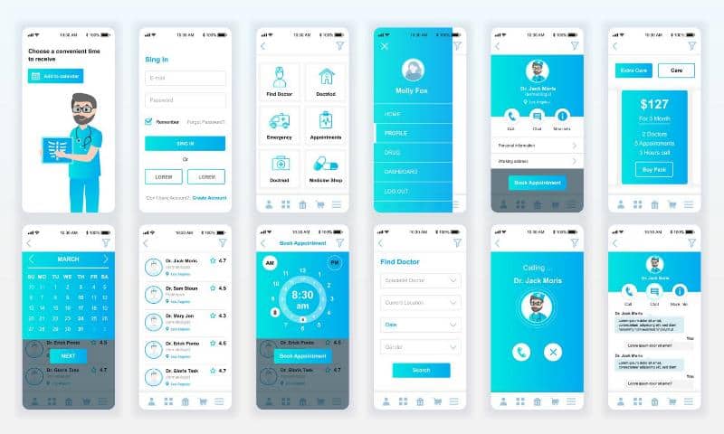
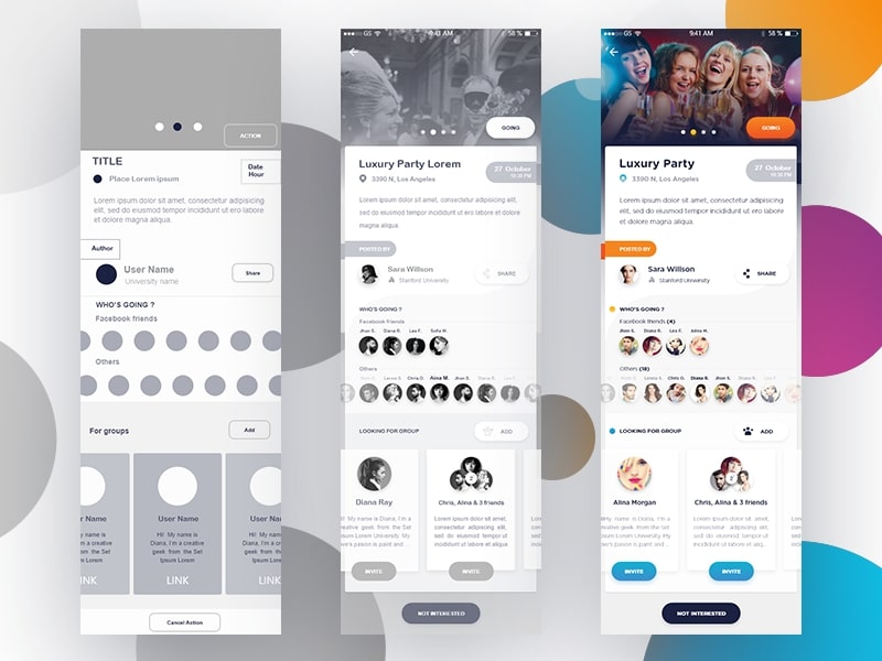
Finally, it's time to transition from simple and grey wireframes to pixel-perfect designs. Hire a mobile app design agency for a faster and seamless transition. In each scenario, some designers use Sketch to create their app designs while others use Illustrator. After having the final files, update your prototype to make it look and feel like it's live.
Sharing Your Prototype With Investors

After all that hard work, it's time to be ready for the big presentation. The first step is to land a meeting with an investor. The best way of doing this is through a referral. In case of no referrals, reach out to an investor through a cold email, which is one of your better options.
Conclusion
It's not easy to transition from an app idea to functional requirements to sketches to mockups to prototypes. The process takes time, and for a beginner, it could take months to get to the final stage. That's why contact our UI UX design services to get things done at a fast pace without losing the quality.
Image source: Google images


