

Designing dashboards is common these days. Whether it is a big business or small everyone needs a simple view to showcase important information in an organized and attractive manner. A view that doesn't overwhelm the user rather makes it engaging for them.
There are following tips to design the dashboard
1. Try not to hide information from the user
It's best to hide important information from the user because the user is caught-up in analyzing information that is in front of them so, he wouldn't second guess there is more to it until told so. Adding too many interactions up-front on the dashboard could lead to confusion. Like adding the tabbed view, or hover to reveal new information can seem interesting ideas but can make users overwhelm with all new information. It’s best to keep it as simple as possible. So simple that it’s easy for the user to understand.
2. Don't make the user scroll
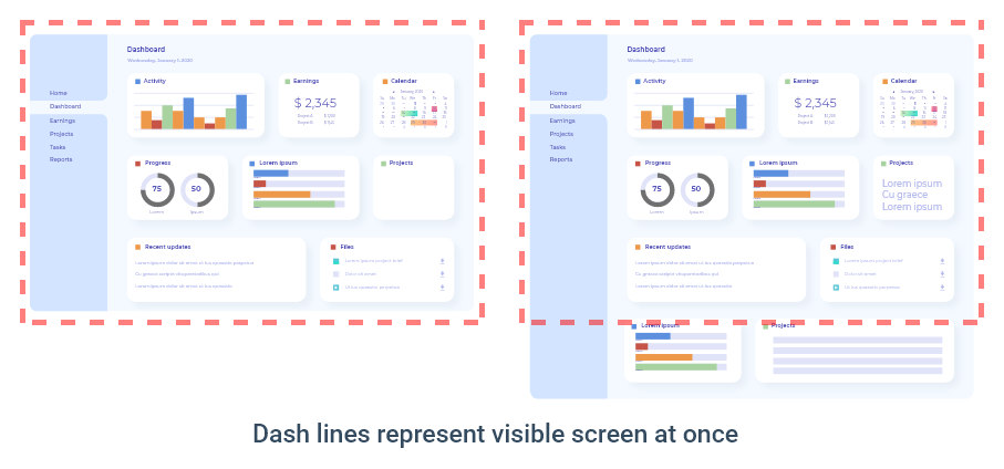
Try to fit in all the information in a single view. You wouldn't want the user to scroll because most of the users will not scroll. Only make them scroll if there is important information that they might wanna know about that too not much. Making a super-long 'webpage' like dashboards is a very bad idea. Try to keep everything within the screen. To learn more, get in touch with prototype design services
Read more: Tips for Good Splash Screen Designs
3. Keeping the elements of the dashboard far apart
It is also very crucial to maintain white spacing or negative spacing. Negative spacing helps the user read, see, and understand information better. The usage of white space in the dashboard is necessary because we have tons of data in it. If all the data comes together close to each other the user will be left confused as to how things are related to each other. For more, go to web design services.
4. Structuring the dashboards
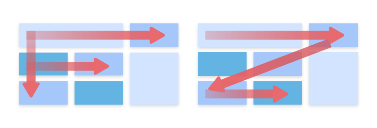
It is necessary to understand what is the function or goal of a dashboard. Then, put the most curial and relevant information to the user. Put the most relevant data from the top left of the dashboard to the top right and then to the left again. The pattern might change to where the user lives if he/she lives in a country where people read from right to left then its a different story. Try to keep important information in ‘F’ pattern or ‘Z’ pattern as that is how the user scans through the webpages page, most people scan left to right and then down through the page just like their reading habits.
5. Choosing the right colours

Choosing the right colours is an important aspect of designing dashboards as it helps differentiate different elements of the it and is easier on the eyes, which helps the user see the important. Color also defines the hierarchy of what the user is looking at so color needs to be chosen in a way that defines priority as well as makes it pleasing to look at.
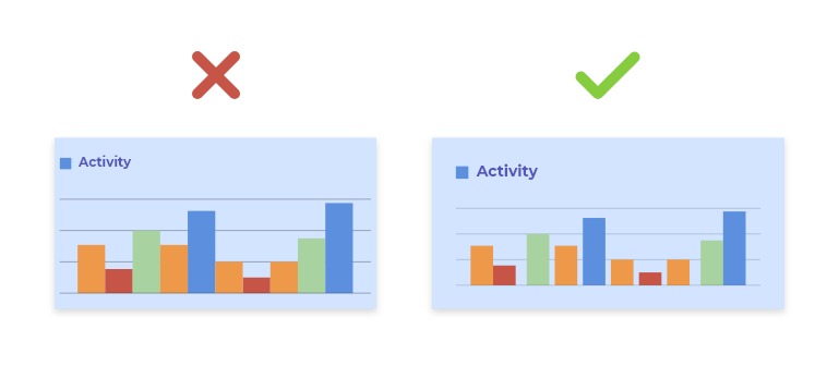
6. Use data visualization to engage and inform

Using charts and graphs to convey important information to the user is an engaging way as it reduces user efforts. As the user doesn't have to read it to understand, they can just look at it and based on their colors, height or shape to understand curial differences and compare them based on that.
Conclusion:
In this blog, I have written about the tips by which you can design dashboards that are engaging and user-friendly. I have written about how you can only focus on showing important things without making the user scroll and use data visualization to make it attractive and yet easier for the user's eyes. The data visualization or graphs make the designs eye-pleasing and attractive.
For better dashboards, you can get in touch with Oodles mobile app design services.


