Software as a Service (SAAS) is a software delivery model that enables users to access online services via subscription. Since SAAS products are available over the Internet, users are not required to download or install the software on individual computers.
Features like affordable rental authorization and scalable infrastructure have led to the massive adoption of SAAS products. According to Gartner, SAAS remains the largest segment of the cloud market with $85.1 billion expected revenue in 2019. However, complex architecture with overcrowded features obstruct the providers of UI UX design services to build intuitive and user-friendly SAAS products.
This blog post decodes the design strategy for creating effective and engaging SAAS products for global businesses-
5 Best SAAS Design Practices 2019
1) Resort to Landing Page
As a rule of thumb, the landing page of any business website must convey its vision in a clear and precise manner. Landing page analyzers suggest that for every 1000 people who visit your site, 800 walk out by merely reading the headline.
Tim Ash, the author of Landing Page Optimization, states the importance of a brand’s value proposition on its landing page by quoting-
“The Rules of Web Awareness: If the visitor can’t find something easily, it does not exist. If you emphasize too many items, all of them lose importance. Any delay increases frustration.”
The alignment of concise headlines, sub-headings, CTA buttons, and a direct message are critical elements of an effective landing page design. A variety of contemporary SAAS companies are making optimum use of their landing pages to accelerate engagement and conversions.
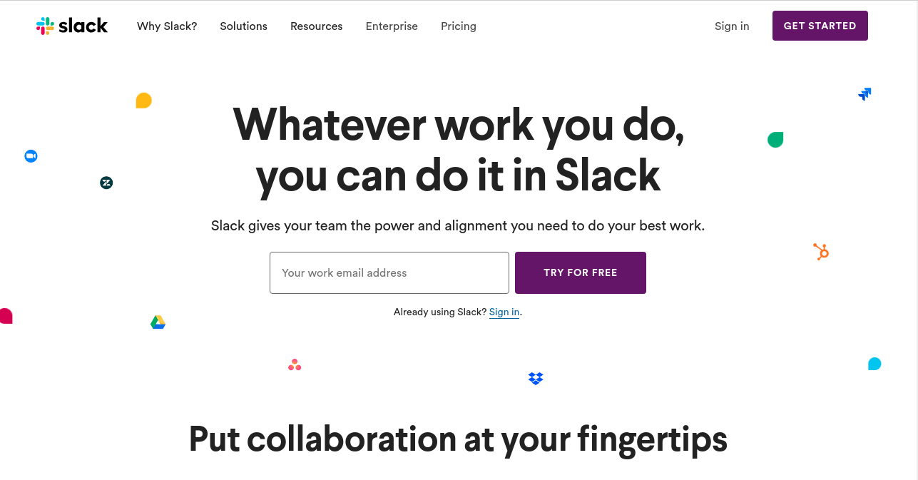
For instance, team collaboration software, Slack, explicitly states the business motive with a crisp CTA button on its landing page.
2) Onboard Users on Product Tours
In the face of a diverse feature list, SAAS companies often find it challenging to wrap everything inside a landing page. Clustered information with bloated web design leads to fragmented user experience and higher bounce rates.
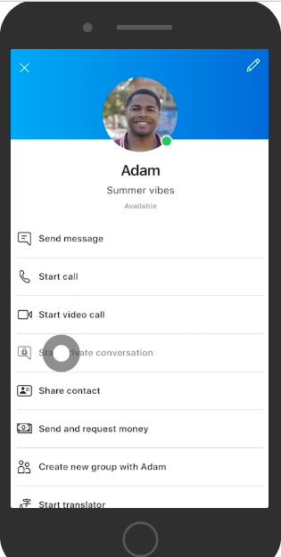
SAAS based telecommunication app, Skype, displays a 2-minute video that uses in-built cursor movements to explain key product features.
Here, quick, non-invasive, and easy-to-understand product tours do the trick. Below are some effective product tour UI tips-
a) Briefly introduce your product features to the new visitors by demonstrating the product’s key functionalities and usability.
b) Back product tour UI with realistic user personas and empathy maps created by user research consultants.
c) Explain product technicalities with brevity, keeping in view the diverse background of your target audiences.
d) Use tooltips within your SAAS infrastructure to walk users through complex account set-ups.
3) Manage Global Navigation
The primary requirement for building intuitive SAAS products is to provide the user with easy and clear navigation. The ‘Menu bar’ meets a critical requirement of users to browse the offerings of a business.
The idea is to give users full control of in-app navigation and optimize user experience significantly. Therefore, when UX designers provide web design services, they ensure that menu items are as orderly and engaging as possible.
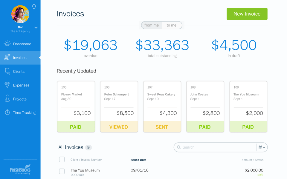
For instance, cloud accounting software, Freshbook comes with a clean global menu aligned to the right of its interface. Its global navigation simplifies the complex architecture to enable seamless user navigation across multiple sections.
4) Blend the right Proportion of Color, Space, and Fonts
For UX designers, screen space is the most vital element to enhance the product’s UI and improve readability. Effective use of white space organizes the visual hierarchy and information architecture within a SAAS interface.
One of the most influential graphic designers of the 20th century, Jan Tschichol, highlights the hidden abilities of white space by quoting,
“White space is to be regarded as an active element, not a passive background.”
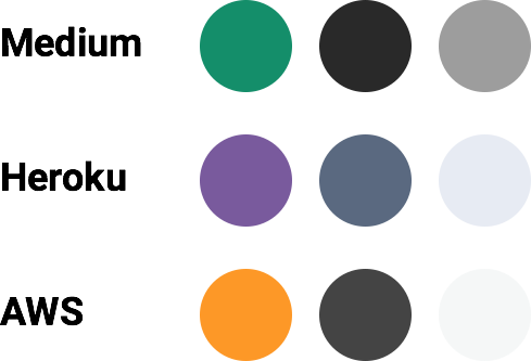
Further, white space perfectly blends with any color palette to reflect a brand’s personality in a subtle manner. However, providers of UX research services should limit a brand’s color palette to a maximum of 3 to 4 distinct colors. A limited and bold color palette builds an emotional connection with the customers and leads to maximum brand recall.
Leading SAAS products such as Medium, Heroku, and AWS use a high visibility brand color balanced with a high contrast dark text color. The last row of low contrast background and border colors completes the pattern in a user-centric manner.
Besides space and color, fonts also play an important role in altering the brand’s voice and its emotional appeal.
a) Usually, well-established SAAS companies such as Microsoft, Adobe, etc use the Serif typeface to represent tradition, reliability, and historical brand values.
b) Whereas, modern-day SAAS interfaces such as Slack, Skype, etc use the Sans Serif font to symbolize refined and polished business attributes.
5) Visualize User Data Systematically
Most SAAS products keep a real-time record of user data to evaluate their activities, performance, and results. It is equally crucial to present this data in a comprehensible and workable manner.
a) Graphs and pie charts with distinguishable color blocks streamline key business metrics and improve productivity.
b) Dynamic sorting is another feature that is commonly used by SAAS companies to optimize search result data as per the user’s convenience.
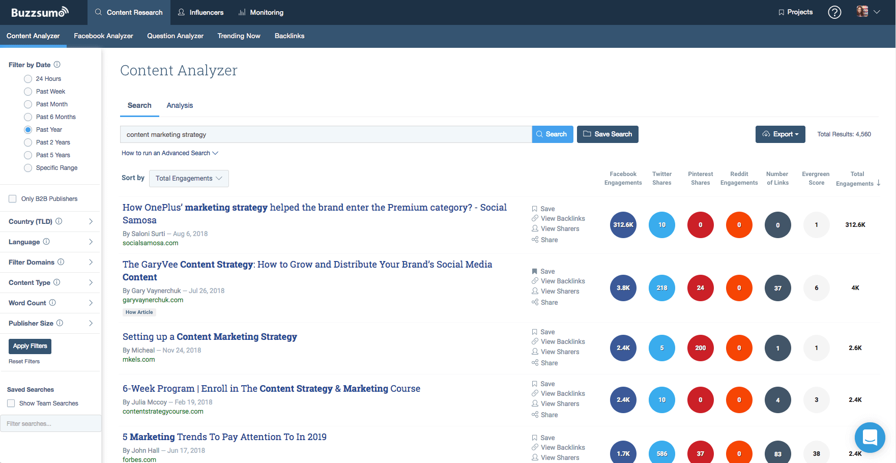
Buzzsumo and Alexa Ranking are good SAAS based examples of web interfaces with well-defined data representation.
You may also like to read- Dot Voting | UX Research Methodology to Prioritize UX Elements
UI UX Design Services for Global SAAS Interfaces
Comprehensive business models such as SAAS, ERP, and CRM constitute the future of the digital landscape. Our UI UX team at Oodles is skilled at building designs for AI applications, SAAS based applications, ERP systems, CRM platforms, Corporate websites, and E-learning portals. Talk to our UX/UI design team to build intuitive and effective digital interfaces for your business.
Image Source- Google

