Website pop-ups and overlays can have a negative impact on the browsing experience of users. Promotional content, in particular, can distract users and drive them away from the website. Bad pop-up practices including poor timing and language dilute brand reputation. It is for this reason that Ethan Zuckerman, the man who invented pop-up ads, apologized for building the world’s most hated advertising medium. It is, therefore, necessary for providers of web design services to use effective pop-ups that positively influence user experience and conversions.
This blog post discusses 5 pop-up design strategies to provide an engaging user experience.
Understanding the Basics of Pop-ups
Pop-ups are additional dialog windows that appear in web pages. Initially, pop-ups were used in abundance mainly for online marketing purposes. Gradually, businesses began to gain user attention by placing pop-ups over the site’s home page, blogs, and other webpages.
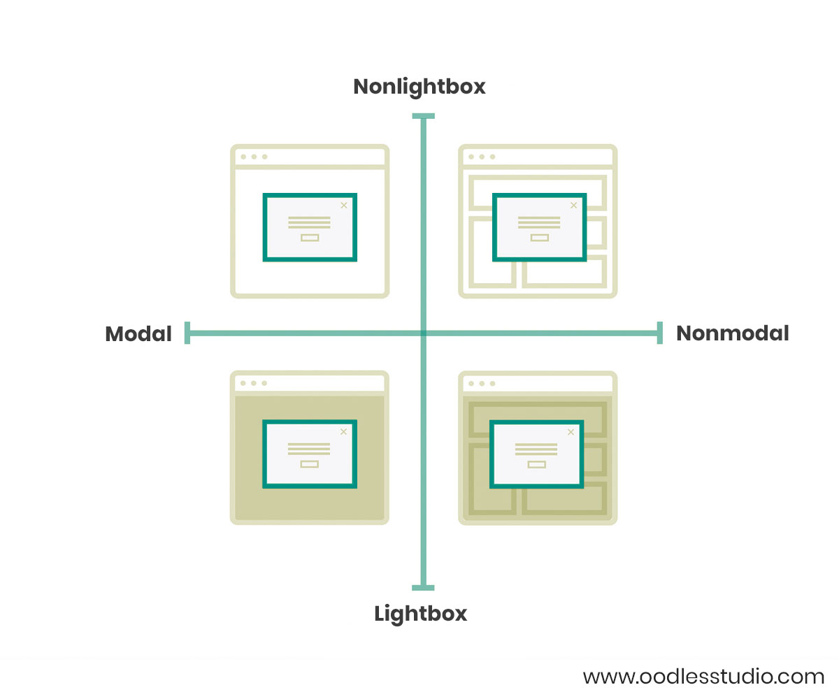
They can be classified into four categories measured on the following grounds-
1) Depending upon user interaction
(i) Modal– A modal dialog disables the user’s interaction with the background page. Users can only resume working on the page when they interact with the pop-up.
(ii) Non-modal– Non-modal dialogs allow the user to continue with the ongoing task while the pop-up remains visible on the page.
2) Depending upon background changes
(i) Lightbox– When a lightbox pop-up appears, the background of the page is slightly dimmed and the content becomes translucent. The user can only interact with the site once he takes action towards the pop-up.
(ii) Non-lightbox– As the name suggests, these pop-ups do not make the background appear visibly dimmed. The practice enables users to read and interact with the background content easily.

5 Effective Pop-up Design Strategies
1) Appropriate Timings
Users access a website either to complete a certain task or to find information about a subject. Pop-ups set a bad first impression when they appear even before the user lands on the main content of the page. It not only hinders users’ attempt to extract value from the page’s content but also results in a lower page ranking.
Google penalizes sites that make content less accessible to users by covering it with pop-ups of any kind. Therefore, providers of UI UX design services should alternatively display pop-ups when-
- Users have successfully completed their intended task.
- Users have reached the end of the page.
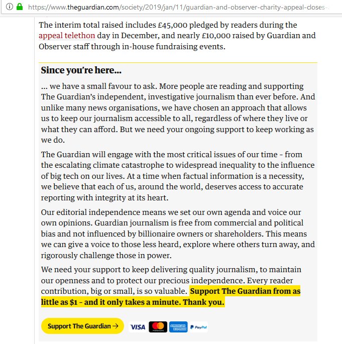
Recently, The Guardian, UK’s news daily replaced its donation pop-up with static content placed at the end of its web pages. It is a more subtle way to appeal to your users than to intrude their news reading experience with modal pop-ups.

2) Managing Pop-ups for cookies
Pop-ups become mandatory under legal obligations such as asking for users’ consent to use their data or gain age confirmation. In such cases, it is essential for businesses to go against their user experience design services and block the accessibility of content. Modal or lightbox pop-ups to display cookies information are an acceptable medium as it keeps users well informed.
3) Provide relevant information
Pop-ups showing relevant and contextual information makes user experience constructive. It is important for users to understand the relevancy of the pop-up content with the site’s current page. Any discrepancy between the page’s content and pop-up information leads to higher bounce rate and unsatisfied users.
For instance, while surfing Youtube videos on desktop, users are prompted with a pop-up saying, “Where music meets your desktop”. It prompts users to try Youtube’s official albums built especially for a desktop experience. Such pop-ups not only engage the users for more content but also enhance user experience significantly.

4) Subtle sign-ups and notifications
Modal pop-ups asking for users’ email addresses or consent to send notifications are another example of interrupting the user experience. Although sign-up pop-ups are an effective medium to fuel online marketing, they hinder the user’s workflow and end up getting neglected.
Instead, businesses must either use-
(a) Non-modal and non-lightbox pop-ups placed on lower-end or corners of the page. These pop-ups neither overlap the page’s content nor disable users’ interaction with the page.
(b) Modal pop-ups placed at the end of the page or at the end of users’ interaction with the site. Providers of user experience design services may also conduct usability tests to understand a user’s reaction towards such pop-up displays.

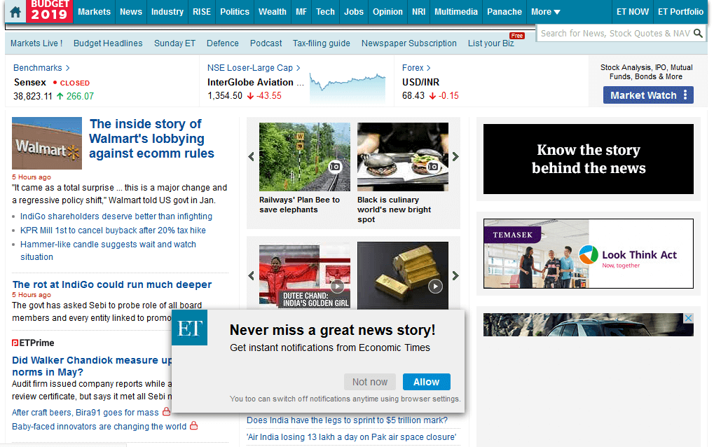
For seamless user experience, the Economic Times website has replaced its modal and lightbox notification pop-up with a non-modal one.
Similarly, the online publishing platform, Medium replaced its huge sign-up pop-ups with a subtle banner displayed at the bottom of their pages. Previously, the pop-up used to cover the entire page’s content and therefore prevented users from readily accessing any information. Medium has improved user engagement by replacing the intrusion with a banner pop-up.
5) Asking feedback at the right time
Feedback is important for businesses to understand their shortcomings and optimize further. However, bombarding users with feedback pop-ups as soon as they visit your site may land you with no feedback at all.
It is advisable to display feedback pop-ups only after a user completes the task in hand. Also, pop-up displays on critical pages such as checkout pages, or transaction pages make task completion difficult and make users anxious.

For instance, Uber jumps in for feedback right after a customer has reached his desired destination. It makes the feedback realistic, useful for Uber, and appears as an empathetic gesture to the user.
Furthermore, businesses must avoid using pop-ups unless they contain information that significantly reduces users efforts. Pop-ups that are necessary to proceed to the next page are also an acceptable UX practice.
You may also like to read- Combining AI with UI to Build Intuitive Digital Designs
Intuitive Web Design Services for your Business
We, at Oodles, are a creative UI UX Design Studio, that ideates and builds engaging digital designs for websites, mobile sites, and mobile applications. Our mobile app design services are available for Android, iOS mobiles, smart TVs, wearable gadgets, and other smart devices. Talk to our UX UI Design team for information about our work.
Image Source- Google


